The Biden Administration’s Justice40 initiative rests on two unknowns: who are the disadvantaged communities (DACs) and how do we define the “40 percent of overall benefits” that will flow to them? We now have the clearest sense yet on at least the first of these questions.
At least three pieces of analysis on the latest version of the Climate & Economic Justice Screening Tool (CEJST) have been released in recent months. The analyses from WE Act, Rhodium Group and World Resources Institute (WRI) all draw on similar approaches to understand how CEJST impacts different racial and ethnic groups. Given the similarities in the approaches between the analyses, let’s look at one of them – the analysis from WRI released in March 2023 – to see what it can tell us about the tool.
What is the CEJST?
This tool helps federal agencies identify disadvantaged communities that are underserved and overburdened by pollution. The tool will be used for the Justice40 Initiative, which seeks to deliver 40 percent of overall benefits from federal investments in climate and clean energy to disadvantaged communities. Justice40 applies only to “covered programs.” In August 2022, the Administration released a list of those covered programs.
The tool was developed by the Council on Environmental Quality (CEQ) in the White House and identifies disadvantage at a census tract level (generally 1,200 – 8,000 people). CEQ released version 1.0 of the tool in November 2022, an update from a beta version released in February 2022.
How does the tool work?
The tool features eight categories – climate change, energy, health, housing, legacy pollution, transportation, water and wastewater, and workforce development. Under these categories, there are 18 indicators.
Communities are considered disadvantaged if they meet 90th percentile thresholds for any of the 18 indicators and are “in the 65th percentile or above for number of households with income less than twice the federal poverty level.” Further, all communities that are within Federally Recognized Tribes are classified as disadvantaged communities and all communities that are “completely surrounded by other disadvantaged communities and are at or above the 50th percentile for low-income as disadvantaged communities.”
What is the difference between CEJST Beta Version and Version 1.0?
CEJST 1.0 now includes:
- Nine new indicators including fire risk, flood risk, green space, historic underinvestment, indoor plumbing, abandoned mines, formerly used defense sites, transportation barriers, and underground storage.
- Two new criteria to define disadvantage – tribes and communities that are completely surrounded by other DACs (as per the criteria above).
Version 1.0 is considered to be the official version of the tool.
What does the analysis say about the impact of these changes?
Race is not factored into the tool, apparently for legal reasons according to the Biden Administration. The analyses from WRI, WE Act and Rhodium are therefore crucial to understand the relationship between race and the tool. The number of communities identified as disadvantaged increases, particularly communities of color.
WRI’s analysis found that 33 percent of the United States population are now living in disadvantaged communities, compared to 29 percent of the population in the beta version. Because a larger percentage of the country is now classified as disadvantaged, Justice40 may become less targeted to the most disadvantaged communities. According to WRI, the new indicators “drive much of the overall increase in the number of communities identified as disadvantaged.” One criticism among environmental justice advocates is that the new tool covers more white communities even though most of the population that live in disadvantaged communities and experience disproportional environmental and health burdens are Black, Hispanic/Latino, and Indigenous peoples. With these new indicators, “the white population now makes up about 40% of the population in disadvantaged communities, up from 36% in CEJST Beta, while the share of other groups decreases.” Three of these new indicators – abandoned mines (81.3 percent), transportation barriers (57.1 percent), and formerly used defense sites (50.7 percent) – disproportionately benefit white communities.
What is cumulative burden?
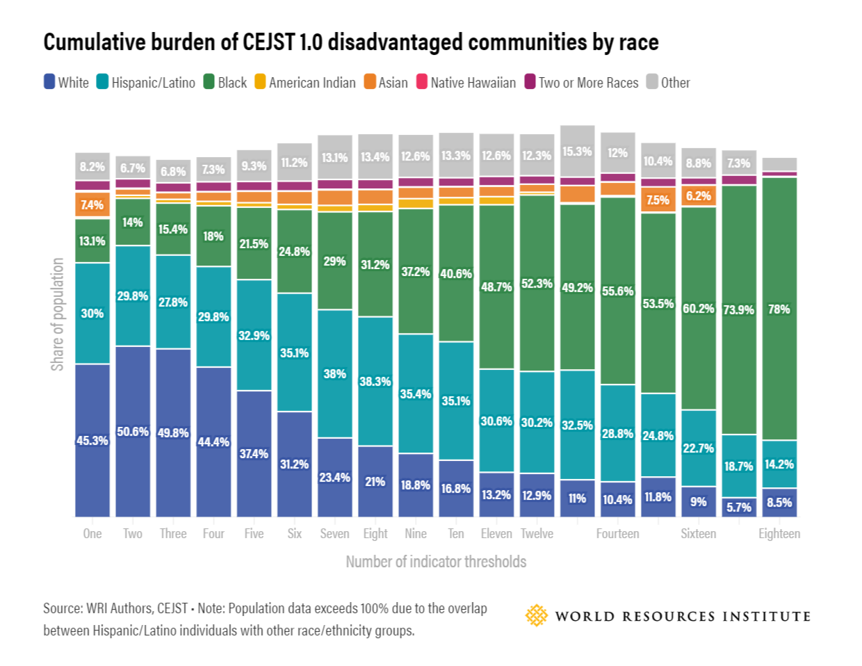
Another criticism about the tool is that it does not factor in cumulative burden. Cumulative burden is the “total harm to communities that occurs due to a combination of environmental, socioeconomic and health-related burdens.” If there is no cumulative burden, then every community that qualifies as disadvantaged is treated the same and there are no incentives for investing in communities with greater disadvantage. The figure above disaggregates the data on cumulative burden race. As the number of indicators increases, the proportion of the white population decreases. That is, the most disadvantaged communities are much more likely to be Black and Hispanic/Latino.
How does this tool interact with other tools?
As CEJST was being developed, other Agencies developed interim tools to guide planning. The CEJST is meant to supplant those tools in identifying disadvantaged communities for the sake of federal funding. The DOT created the Transportation Disadvantaged Census Tracts tool, which can be used to map project areas to determine the level of disadvantage according to DOT’s Justice40 definition. According to the tool, 30 percent of the U.S. population lives in disadvantaged/Justice40 areas. The DOE created the Energy Justice Mapping Tool to allow users to explore and produce reports on census tracts that the Agency has categorized as disadvantaged communities. There are 36 “burden indicators.” And the EPA developed EJSCREEN.
States also have their own tools – see for instance CalEnviroScreen, Pennsylvania’s Environmental Justice Areas Viewer, Oregon Statewide Equity Index, Colorado’s EV Prioritization Tool or New York’s Disadvantaged Communities Map. These tools often draw on state level data and so may be a useful complement to CEJST. States also have their own tools – see CalEnviroScreen, Pennsylvania’s Environmental Justice Areas Viewer, Oregon Statewide Equity Index, Maryland’s MD EJScreen, Colorado’s EV Prioritization Tool or New York’s Disadvantaged Communities Map (the finalized version was released on March 27th 2023). This tool helpfully summarizes many of these tools in one place.
State level tools often draw on state data and so may be a useful complement to CEJST. In Oregon’s NEVI plan, for instance, the state will use the Index and ensure that it “complements” the federal Argonne National Lab tool (the interim tool for EV charging) but “could potentially be used, for example, to help decide between two otherwise similar potential station locations.”
What’s next?
We expect that the CEQ will release a scorecard on benefits over the next few months – though the timing is unclear.
Also, as WRI notes, the tool is not meant to be static and will go through iterations. If that is the case, the definitions of DACs will continue to shift, and we may see further versions of CEJST to come. The CalEnviroScreen, for instance, is on Version 4.0 and so it is a reasonable assumption that this tool will also continue to evolve.


